Big news! I'm working on getting the shop page set up on the site, where you'll be able to purchase prints from my Instgram theme project. I've curated sets of 3, 6 and 9 photos from the various themes and am just working on finalizing the layout. Which one below do you like better? Centered or off-centered? I'm planning on offering these as 8x12 prints, and leave a comment to let me know what you think!


Typecast
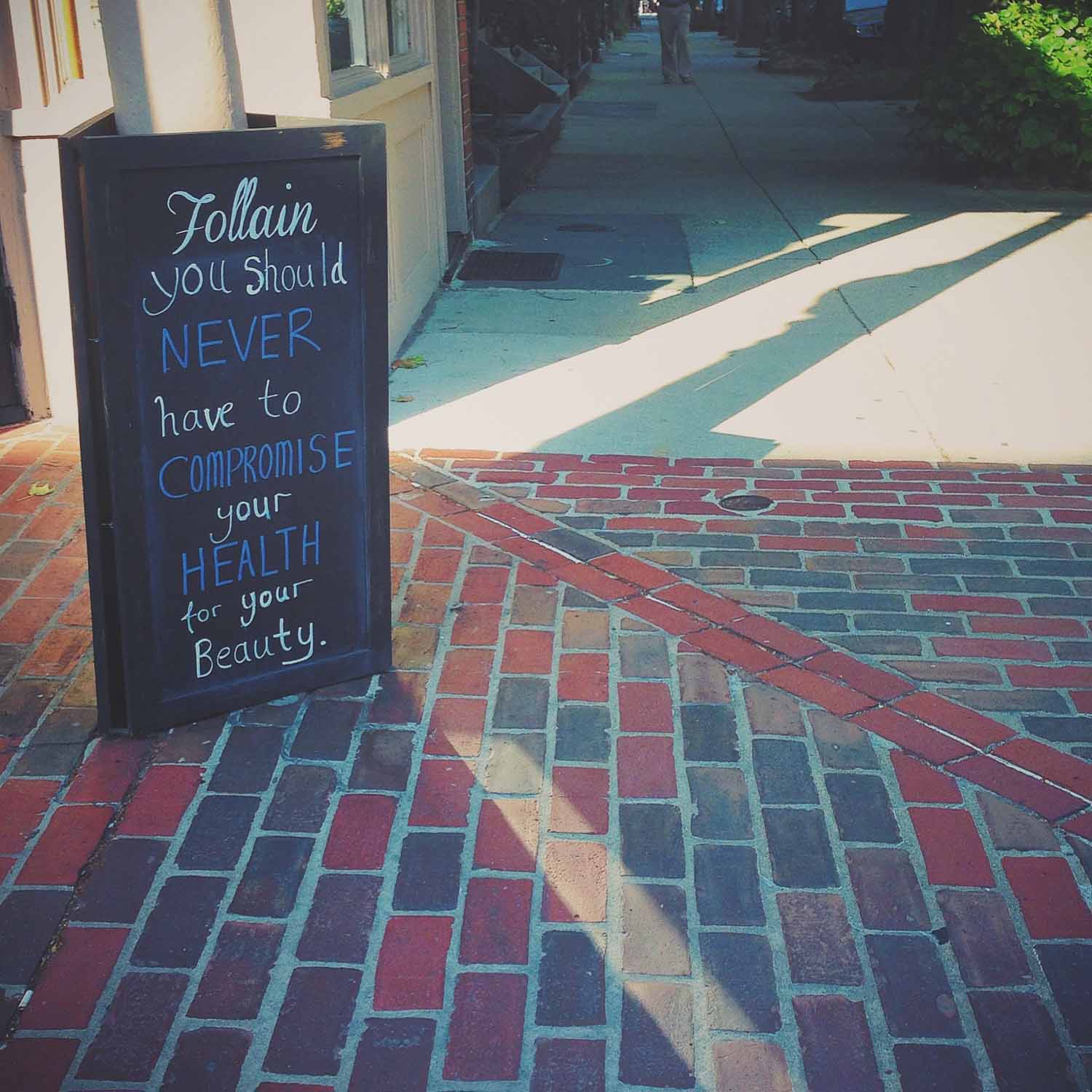
This theme was inspired by other feeds I had seen on Instagram that focus on type and signage. I wanted to depict interesting typography, fonts and uses of words in the urban landscape. I always loved graphic design in school and companies and advertising use a lot more visually bold text lately. But I tried to focus on unique, found text rather than all the more official signs and words around us on a daily basis.
There was such a variety of options that I found a different problem than when I don't find enough subjects. I took a lot more photos than what I posted, and deliberated more about which ones to use. I felt they weren't looking as cohesive of a group as some of my past themes. Most of them seem to stand better on their own. I think if I had focused on just letters, or just signs, they might have matched more. I also originally included the picture to the right, but replaced it below with another more focused on type. This one was me falling back into my natural style and editing, rather than sticking to the theme!


Orange is the new...
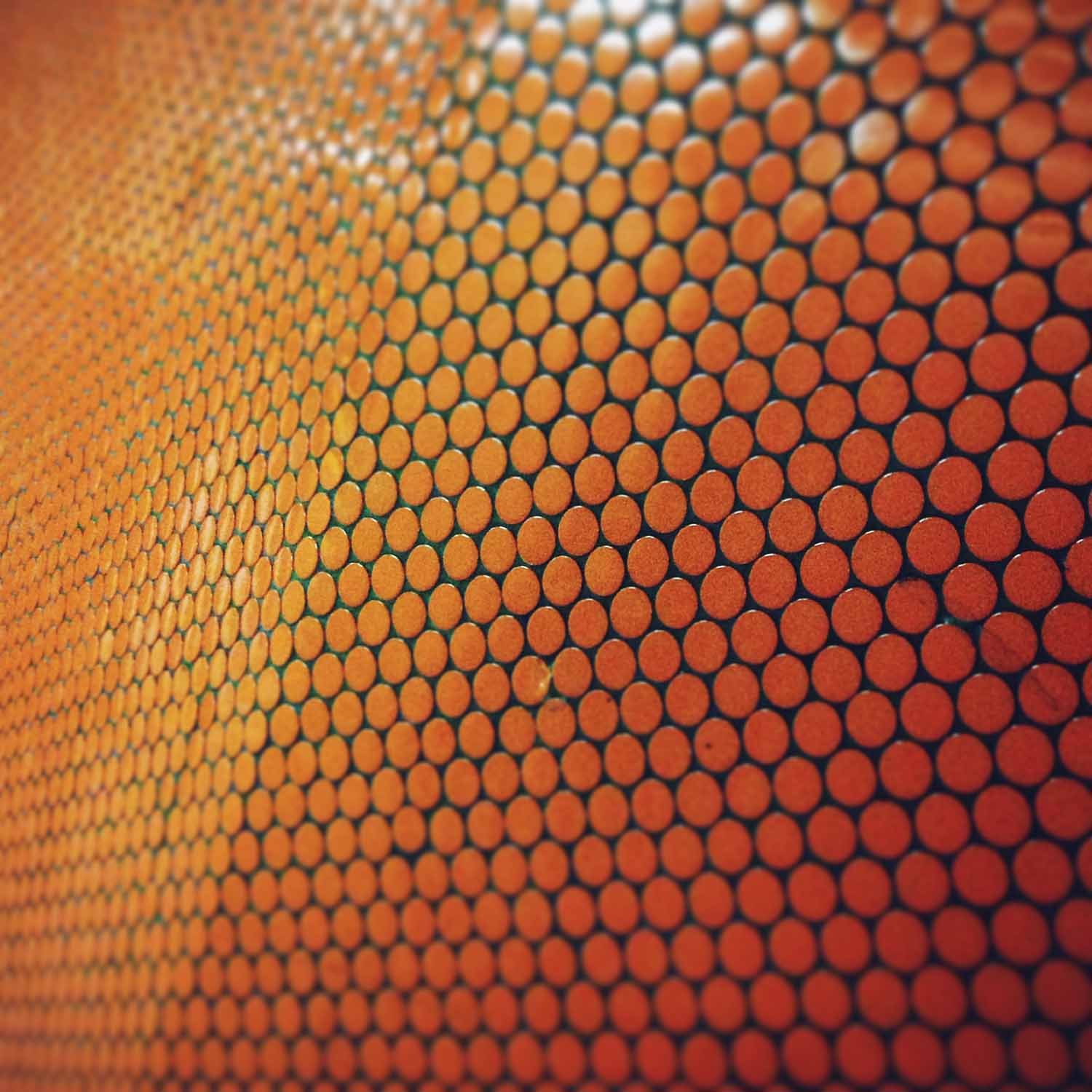
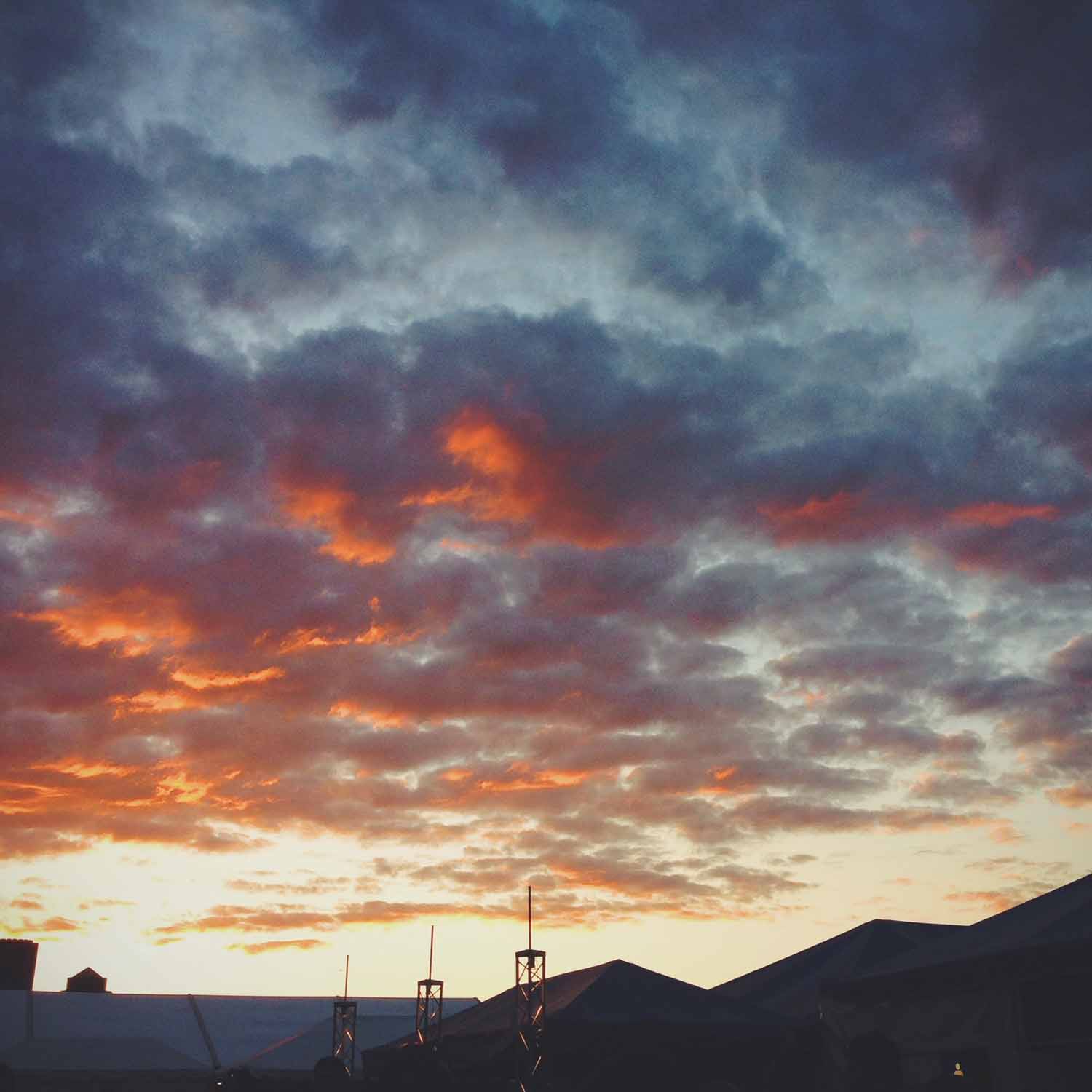
I honestly didn't have the Netflix show in mind when I picked orange for the next theme. I wanted to do another color week, and orange seemed like a good choice for the start of summer. Orange isn't as prevalent as some of the other colors I've done, unless I just focused on construction and warning signs. So it forced me to look for subjects in new places a bit, including posting the first portrait and sunset so far in this project. Portraits, I should do more of, but I try to steer clear of sunsets and flowers. It's just too easy (and pretty).
But as always, opportunities present themselves. Walking home from work, I spotted the orange garland flags draped across the front of a brownstone. There were no birthday signs or other decorations, so I don't know what they were for, but how random to use orange. It must be good photo karma!


Split screen
This theme was about symmetry, and I was surprised that it was much harder than expected. It was influenced by Wes Anderson and his style of cinematography, which I love. Around the time his most recent movie, The Grand Budapest Hotel, was released, a video compilation of his movie scenes was posted online. It shows Anderson's obsession with, and mastery of, symmetry in his shots. It's mesmerizing to watch and impressive that he creates it so consistently, especially since as the viewer, it doesn't seem to be obvious or oppressive. I myself didn't notice how prevalent it was before watching that clip, and I've seen all these movies multiple times.
So I thought this wouldn't be that difficult. Sure, symmetry is everywhere, but I quickly found this theme was becoming an excuse for me to just take more pictures of architecture. I tried to switch to objects, but found that a lot of compositions and the resulting images weren't visually interesting to me. Even with editing and filters, they just looked flat. The genius of Wes Anderson's compositions is that they appear simplistic, but are carefully crafted of many components and layers. It's something I realized has to be created for the most part, rather than stumbled across while I'm out searching for photos. I also realized I like taking photos that are often not symmetrical, with something askew or at an angle, or lines that criss-cross the frame. Surprising, since I love Wes Anderson's visuals so much.
It took me a long time to choose these final nine. While many are still architecture-related, I did begin to find more interesting objects and subjects than just classical columns and the geometric facades I started with. I ended up choosing a group of images that created a variety of colors, subjects and types of symmetry. Though the photo with the columns and arches reflected in the water is still my favorite. *sigh*


From where I stand
This theme was different for me, and a bit of an experiment. When I first joined Instagram and started my project, I thought it was just about posting photos, not much different than Facebook. But I've since found it's quite the community, with many nuances. I quickly learned that there were universal tags for certain kinds of photos, and whole groups devoted to those tags. Some of my favorites have been #strideby, #morningslikethese and #fromwhereistand.
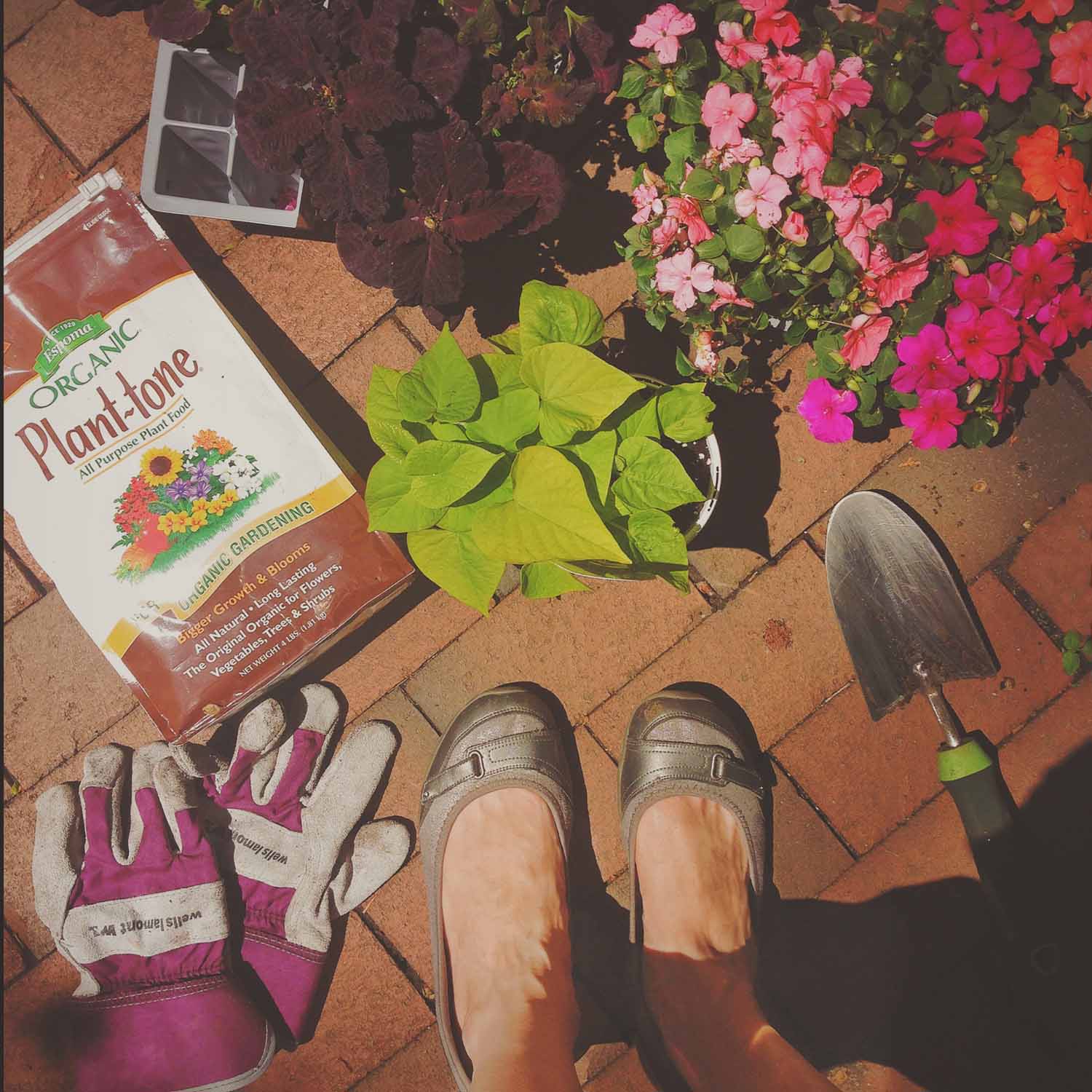
I really love #fromwhereistand. It's amazing how much you can see and find out in a fairly limited perspective and there's a huge variety of subjects, despite just looking down. As for a theme, it's also one of the tags that could be most in my control. So I decided to focus on photos of my everyday life from the viewpoint of my feet and see where it took me.
I really love these photos and enjoyed the chance to do something very Instagram-y. They go together well as a set and they're stronger visually than I expected. Even better, they truly represent my daily life:
Starting at the bottom, the pink blossoms are signs of the many trees in my neighborhood; I walk by those drain plaques constantly on the way to work; my little patio garden has become my regular weekend hobby; my Saturdays are almost always the same: two magazines and coffee on the couch; Chris and I are big music fans and Boston Calling is the perfect combo of a concert and our urban life; the shot on the stairs is from my first Instagram meet-up; we try and take advantage of the short walk down to the Charles and Esplanade on nice days; we were in a parking garage because we bought our first car together (!); and living in Boston means coming across history on a daily basis.
Take a closer look at the photos, and my shoes!