This is the second time I've done the color red as a theme, and the first time I've repeated a theme. But the last time I chose red, it was December 2014, so most of the photos had a definite holiday look to them. This time I thought it would be more of a challenge to try seeking out red subjects in more everyday places and things, without the benefit of a lot of holiday decorations.
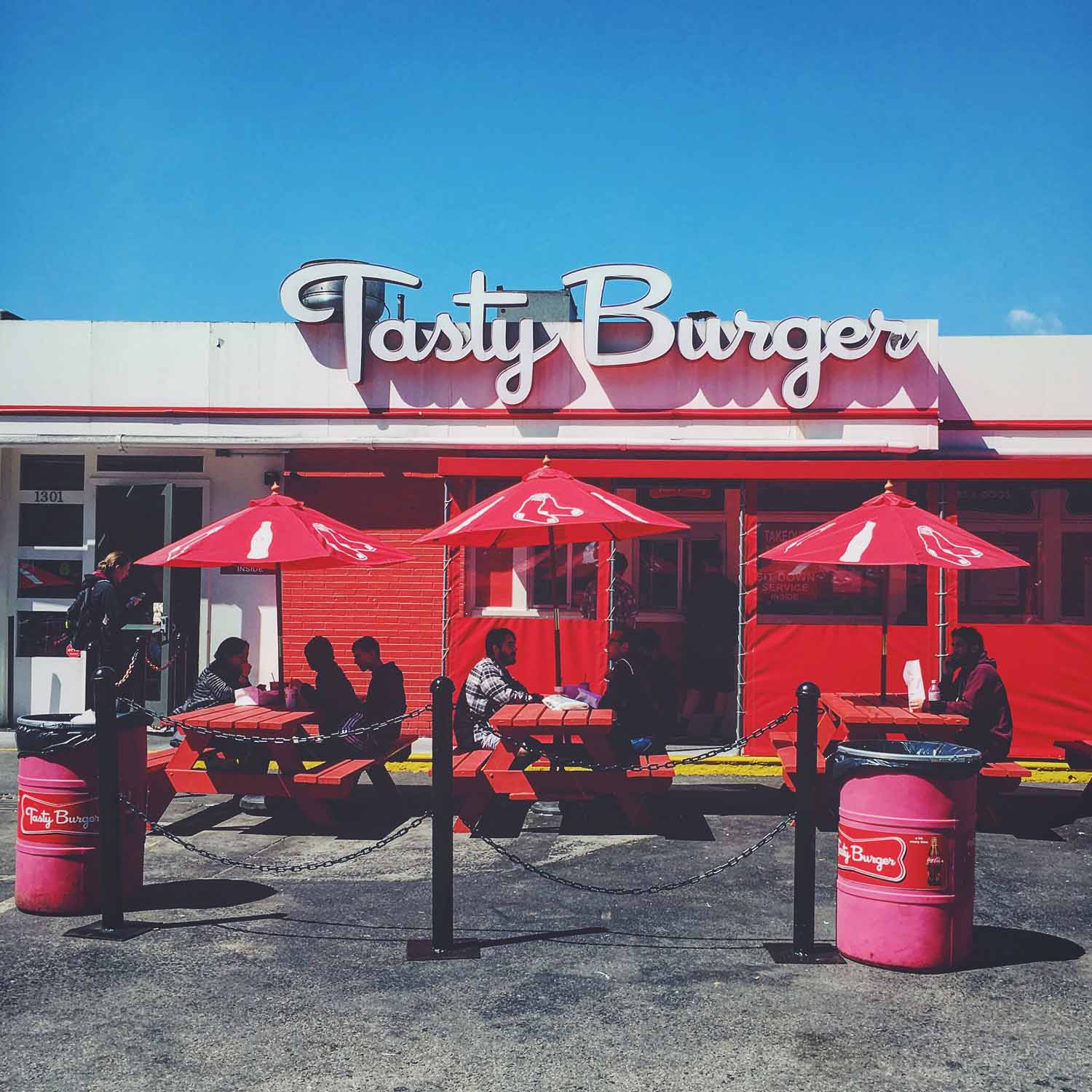
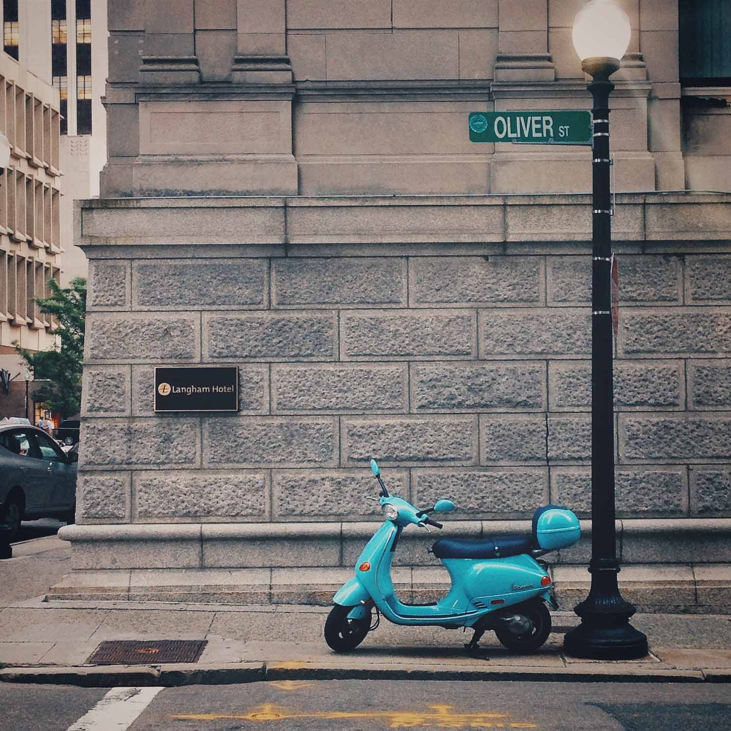
I really like this group of photos. Now that it's summer, the colors really pop. I'll admit it's not that hard to find red in a city with the Sox. But I tried to find a few other, less obvious shots as well, and once again stumbled upon some great finds, like the scooter and the chairs. This group also includes two photos from our recent trip to Sydney and Hong Kong. I have yet to put most of my travel photos online, and since I use my Instagram account just for this theme project, I haven't posted them there either. From time to time I have great photos that don't fit the current theme I'm on, so I don't post them on Instagram, which sometimes I regret. This was a small way to get at least two in there. I promise there are more to come!


Color of the season
With the holidays fully over, it's time to wrap up my last theme of the year: red. I wanted to do another color, since I knew it would be a busy time of year, and red is everywhere during the holidays. I definitely planned to include some decorations, since I wanted to post fun Christmas photos too, but I tried to still find the color red in my everyday surroundings and stay true to my project. It was a challenge, partially because I've developed an editing style lately that tends to have more blue tones and muted, low-contrast colors. Some bolder reds just didn't look right next to my other photos. But I ended with a good variety; maybe I'll try this theme again in the summer when there are fewer easy options around.
And with a new year ahead, I've decided to carry on with the themes. It was originally a year-long project, but I've enjoyed it a lot, and it's really pushed me to get out and photograph more. So until I think of a new project, I've put together a new list of themes. Stay tuned!


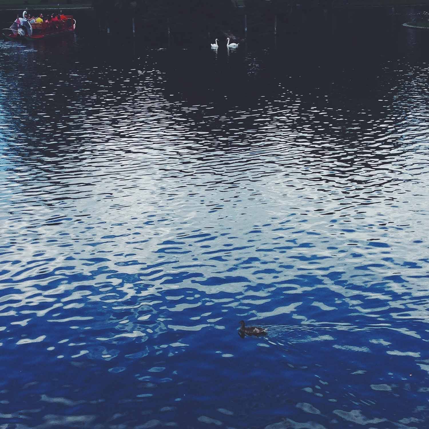
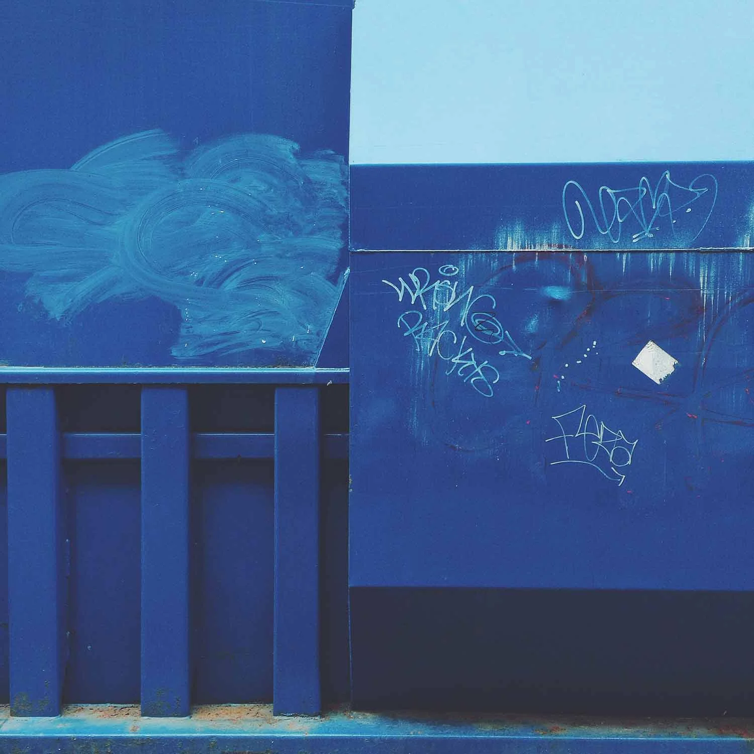
Feelin' the Blues
I always go back to color themes when I'm feeling a bit uninspired. After a busy summer, I had gotten behind on my schedule and wasn't easily finding photos I was happy with. I decided to pick a color again since those had been reliable in the past. But blue was tricky, because I only wanted to do one sky or water photo. It seemed there weren't a lot of other possibilities.
I was starting to feel discouraged again about a lack of blue subject matter, but I finally had the time one afternoon to just go wander, always the best cure. By only walking a few blocks, I found a ton of great options and ended the theme on a stronger note. This is a fun set, with a good variety between full-frame color and individual objects. Enjoy!


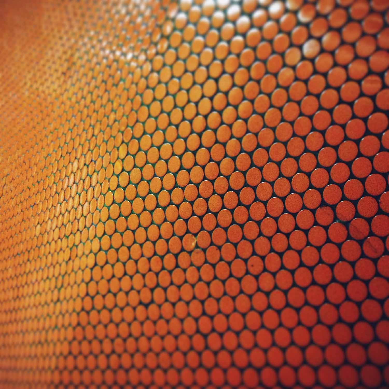
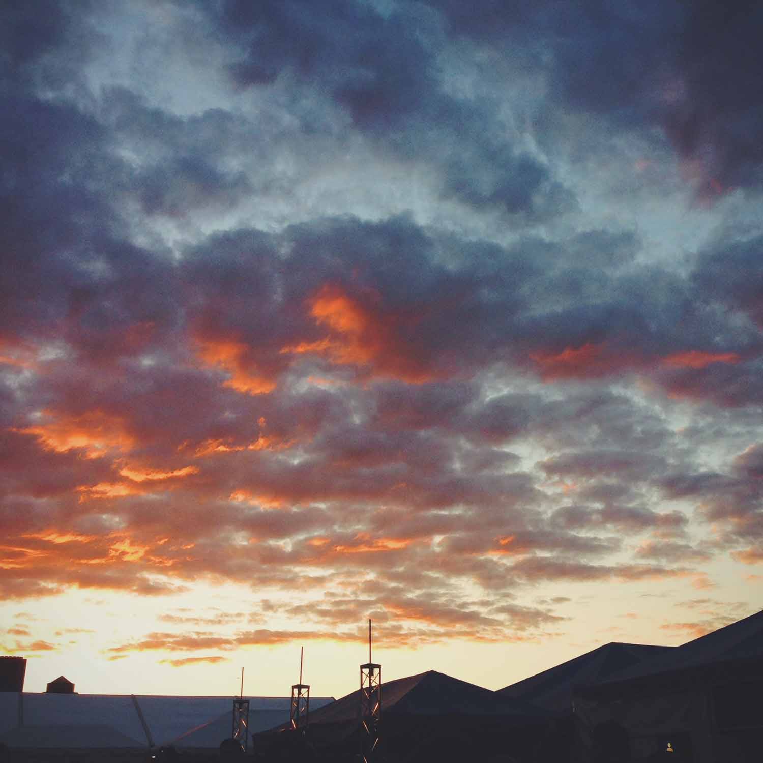
Orange is the new...
I honestly didn't have the Netflix show in mind when I picked orange for the next theme. I wanted to do another color week, and orange seemed like a good choice for the start of summer. Orange isn't as prevalent as some of the other colors I've done, unless I just focused on construction and warning signs. So it forced me to look for subjects in new places a bit, including posting the first portrait and sunset so far in this project. Portraits, I should do more of, but I try to steer clear of sunsets and flowers. It's just too easy (and pretty).
But as always, opportunities present themselves. Walking home from work, I spotted the orange garland flags draped across the front of a brownstone. There were no birthday signs or other decorations, so I don't know what they were for, but how random to use orange. It must be good photo karma!


Easy being green
This theme was again devoted to one color, green, just like the very first week. At the beginning, I had the same concerns as I did last time: that I wouldn’t find enough shots of that color. And just like last time, I was happily surprised to find it everywhere. As soon as you start looking for a color, you start to notice how often it’s used in everyday places. I didn’t even have to resort to photographing new spring plants, one of the reasons for picking green. I found a great variety of subjects, but they all still have a unifying look. The two colors I’ve done are now some of my favorite photos, and they look the best when displayed together.

I really like the first photo I posted of the garden hose (right). It's a perfect sign of spring and was a shot of color on an otherwise quiet residential street. But as I went along and came across so many other green options, I found that the color was filling up the frame much more than in this first one. So I decided to replace it with another image I didn’t originally post up on Instagram. I think they match so well now that I won't say which one is new!
Enjoy and here’s to finding more green things popping up from the ground soon!


