• Work
  • About
  • Blog
  • Contact
  • Shop

maggie loh photography

  • Work
  • About
  • Blog
  • Contact
  • Shop

Split screen

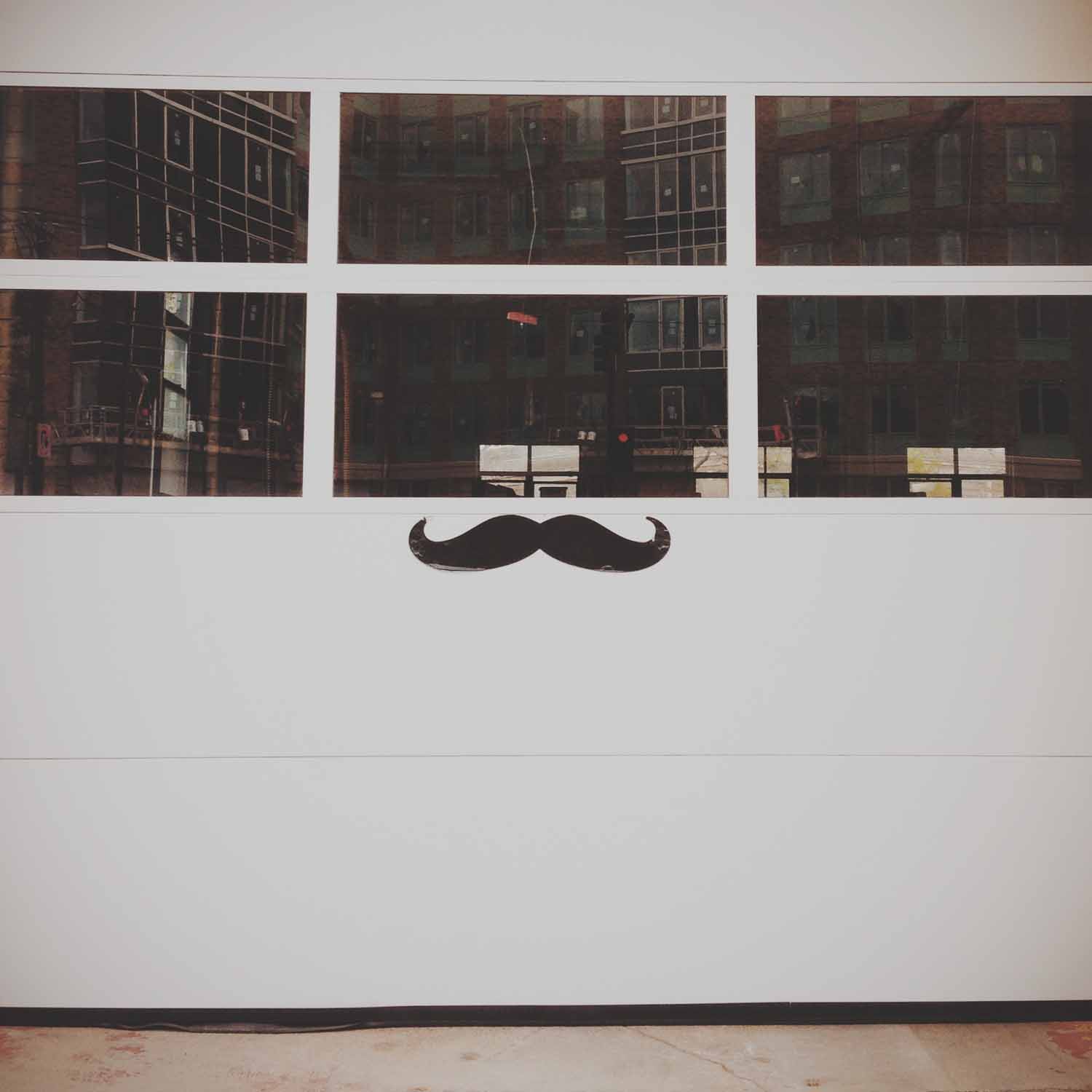
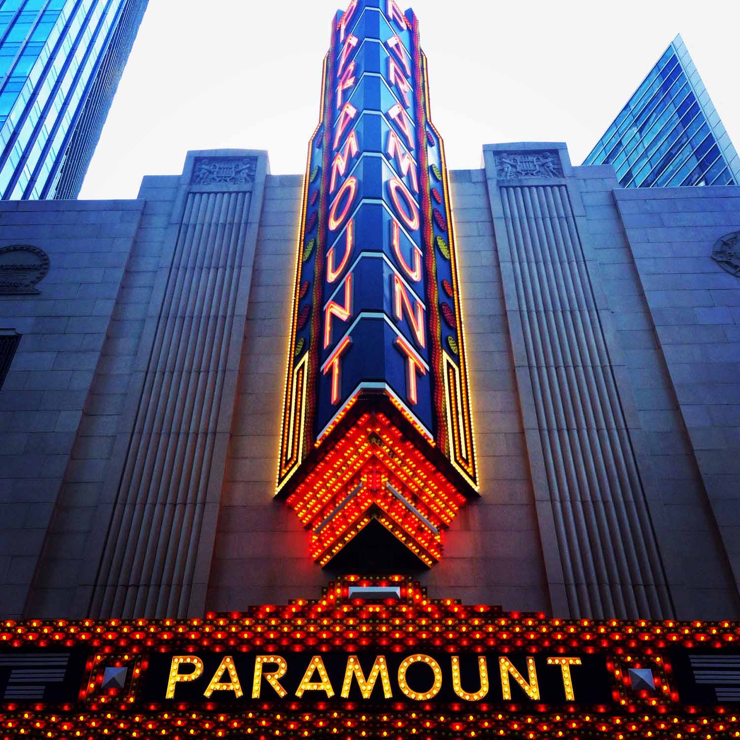
This theme was about symmetry, and I was surprised that it was much harder than expected. It was influenced by Wes Anderson and his style of cinematography, which I love. Around the time his most recent movie, The Grand Budapest Hotel, was released, a video compilation of his movie scenes was posted online. It shows Anderson's obsession with, and mastery of, symmetry in his shots. It's mesmerizing to watch and impressive that he creates it so consistently, especially since as the viewer, it doesn't seem to be obvious or oppressive. I myself didn't notice how prevalent it was before watching that clip, and I've seen all these movies multiple times.

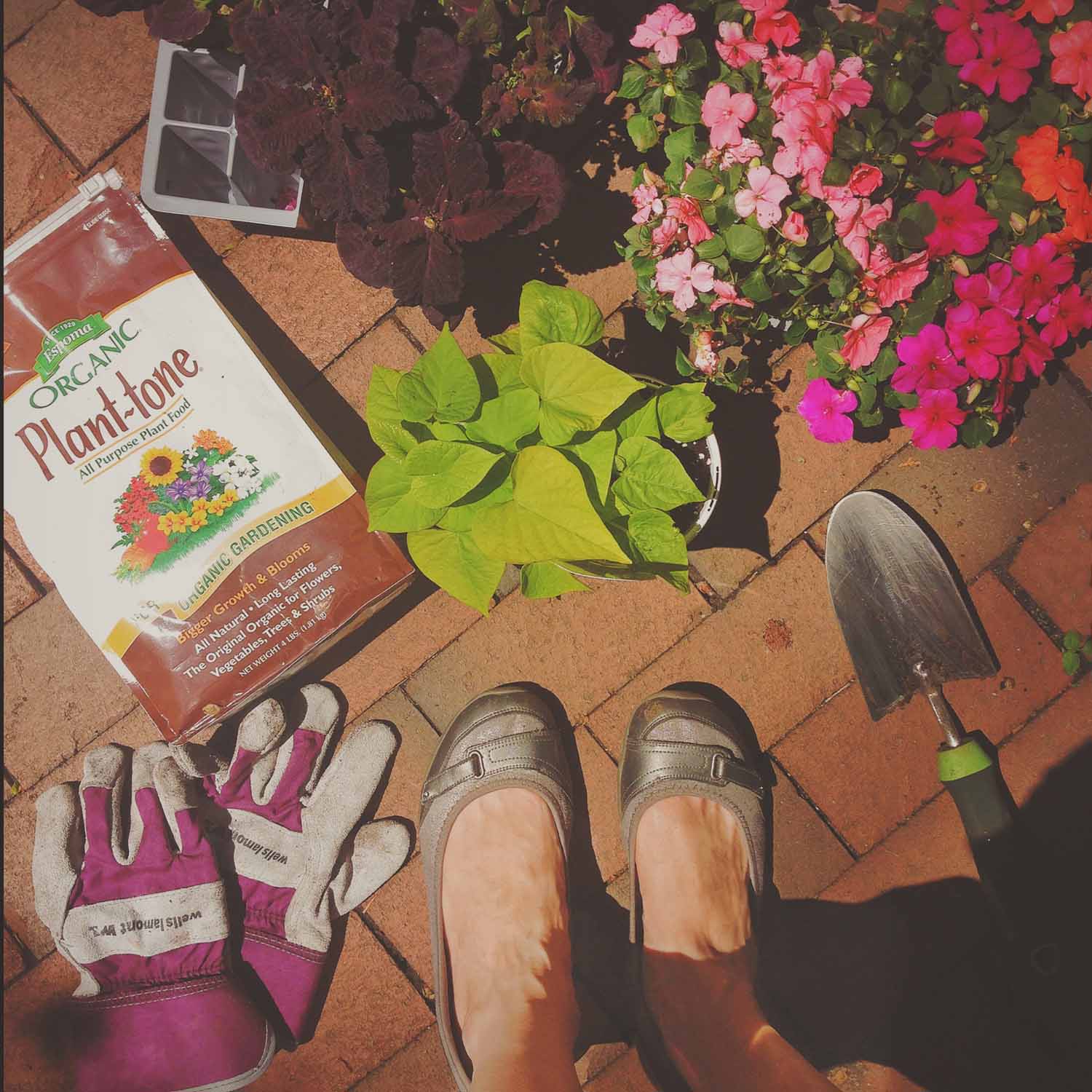
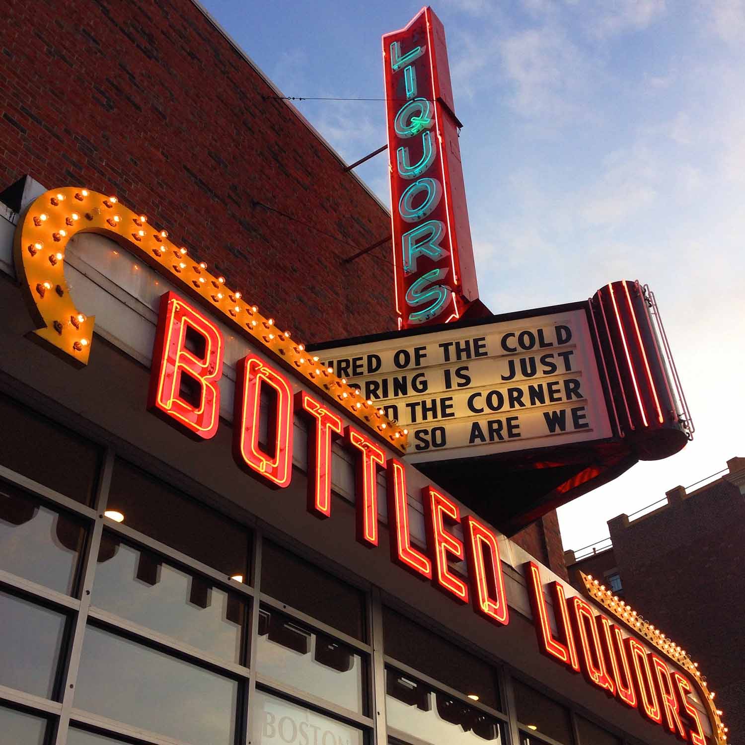
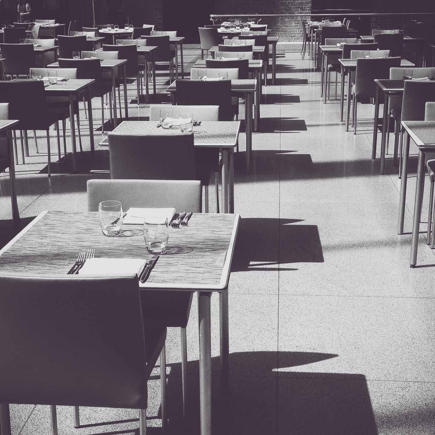
So I thought this wouldn't be that difficult. Sure, symmetry is everywhere, but I quickly found this theme was becoming an excuse for me to just take more pictures of architecture. I tried to switch to objects, but found that a lot of compositions and the resulting images weren't visually interesting to me. Even with editing and filters, they just looked flat. The genius of Wes Anderson's compositions is that they appear simplistic, but are carefully crafted of many components and layers. It's something I realized has to be created for the most part, rather than stumbled across while I'm out searching for photos. I also realized I like taking photos that are often not symmetrical, with something askew or at an angle, or lines that criss-cross the frame. Surprising, since I love Wes Anderson's visuals so much.

It took me a long time to choose these final nine. While many are still architecture-related, I did begin to find more interesting objects and subjects than just classical columns and the geometric facades I started with. I ended up choosing a group of images that created a variety of colors, subjects and types of symmetry. Though the photo with the columns and arches reflected in the water is still my favorite. *sigh*

View fullsize IMG_4561.jpg
View fullsize IMG_4509.jpg
View fullsize IMG_4566.jpg
View fullsize IMG_4562.jpg
View fullsize IMG_4560.jpg
View fullsize IMG_4564.jpg
View fullsize IMG_4565.jpg
View fullsize IMG_4567.jpg
View fullsize IMG_4568.jpg
tags: assignment, architecture, photo, week11, urban landscape, Boston, urban, Cityscapes, symmetry, photography
categories: Theme, Architecture, Assignments, Photography
Saturday 06.14.14
Posted by Maggie Loh
Comments: 1
 

From where I stand

This theme was different for me, and a bit of an experiment. When I first joined Instagram and started my project, I thought it was just about posting photos, not much different than Facebook. But I've since found it's quite the community, with many nuances. I quickly learned that there were universal tags for certain kinds of photos, and whole groups devoted to those tags. Some of my favorites have been #strideby, #morningslikethese and #fromwhereistand.

I really love #fromwhereistand. It's amazing how much you can see and find out in a fairly limited perspective and there's a huge variety of subjects, despite just looking down. As for a theme, it's also one of the tags that could be most in my control. So I decided to focus on photos of my everyday life from the viewpoint of my feet and see where it took me.

I really love these photos and enjoyed the chance to do something very Instagram-y. They go together well as a set and they're stronger visually than I expected. Even better, they truly represent my daily life:

Starting at the bottom, the pink blossoms are signs of the many trees in my neighborhood; I walk by those drain plaques constantly on the way to work; my little patio garden has become my regular weekend hobby; my Saturdays are almost always the same: two magazines and coffee on the couch; Chris and I are big music fans and Boston Calling is the perfect combo of a concert and our urban life; the shot on the stairs is from my first Instagram meet-up; we try and take advantage of the short walk down to the Charles and Esplanade on nice days; we were in a parking garage because we bought our first car together (!); and living in Boston means coming across history on a daily basis.

Take a closer look at the photos, and my shoes!

View fullsize IMG_4387.jpg
View fullsize IMG_4389.jpg
View fullsize IMG_4390.jpg
View fullsize IMG_4394.jpg
View fullsize IMG_4359.jpg
View fullsize IMG_4391.jpg
View fullsize IMG_4393.jpg
View fullsize IMG_4310.jpg
View fullsize IMG_4395.jpg
tags: photography, photo, assignment, fromwhereistand, Boston
categories: Assignments, Photography, Theme
Saturday 05.31.14
Posted by Maggie Loh
 

Sign of the times

This theme was a lot of fun. Boston has a great mix of old historic signs as well as a lot of neon, art deco and other signs left over from the 60s and 70s. They combine to make for some very visual landmarks along the streets, and bring color to some otherwise plain brick facades.

This is a case where I knew most of the signs I wanted to photograph in advance and went out specifically to those locations. Only a couple of these were ones I stumbled upon along the way. Or for instance, I went to Fenway Park knowing there would be something great there, and ended up photographing the sign painted on a wall that’s kind of off the beaten track, rather than right out front at one of the gates. But the Paramount marquee, piano store, liquor store, Coca Cola ad and Beacon Street sign were all ones I picked out in my head while thinking about this theme.

The main challenge was similar to that with the streetlights, of not shooting everything from below looking up. That’s how most of these signs look their best, which is logical since they were specifically designed to be viewed this way. But I tried to mix it up as much as possible, and I did end up with angles or viewpoints apart from what I planned on for a few, once I got there and saw the best angle (or found there was a truck parked where I was going to stand).

Finally, I included at the bottom one of my favorite photos of Boston that features the inspiration for this theme: the Citgo sign. I thought about including the Citgo sign in this theme, but ideally would like to take the photo from somewhere at the same level, rather than from below, and couldn’t figure out the best way to do it in time. And why try to out-do a photo I like so much anyway?

View fullsize IMG_4048.jpg
View fullsize IMG_4072.jpg
View fullsize IMG_4075.jpg
View fullsize IMG_4125.jpg
View fullsize IMG_4098.jpg
View fullsize IMG_4124.jpg
View fullsize IMG_4102.jpg
View fullsize IMG_4126.jpg
View fullsize IMG_4127.jpg
Sunset over Citgo, from the Top of the Hub viewing level

Sunset over Citgo, from the Top of the Hub viewing level

tags: week9, photography, photo, Street photography, Boston, urban, urban landscape, Cityscapes
categories: Assignments, Photography, Theme
Thursday 05.15.14
Posted by Maggie Loh
 

In the shadows

This was hands down my favorite theme. I've intentionally put it off in order to challenge myself with other themes that may be out of my comfort zone or at least something different. But with warmer and sunnier weather, I couldn't resist any longer. I love the patterns created by light and shadow, or not even patterns sometimes, but interesting abstract art painted on everyday objects and surfaces. The theme also lends itself well to architecture and geometry, two more of my favorite subjects.

There's not much more to explain about this group of images. Except for a streak of cloudy days in there, I had an abundance of photos and had to edit them down to these best nine. Enjoy!

View fullsize IMG_0013.jpg
View fullsize IMG_3961.jpg
View fullsize IMG_0015.jpg
View fullsize IMG_0014.jpg
View fullsize IMG_4018.jpg
View fullsize IMG_0017.jpg
View fullsize IMG_0016.jpg
View fullsize IMG_4024.jpg
View fullsize IMG_3985.jpg
tags: photo, Street photography, Boston, Cityscapes, architecture, assignment, light and shadow, week8
categories: Assignments, Photography, Theme
Saturday 05.03.14
Posted by Maggie Loh
 

Easy being green

This theme was again devoted to one color, green, just like the very first week. At the beginning, I had the same concerns as I did last time: that I wouldn’t find enough shots of that color. And just like last time, I was happily surprised to find it everywhere. As soon as you start looking for a color, you start to notice how often it’s used in everyday places. I didn’t even have to resort to photographing new spring plants, one of the reasons for picking green. I found a great variety of subjects, but they all still have a unifying look. The two colors I’ve done are now some of my favorite photos, and they look the best when displayed together.

I really like the first photo I posted of the garden hose (right). It's a perfect sign of spring and was a shot of color on an otherwise quiet residential street. But as I went along and came across so many other green options, I found that the color was filling up the frame much more than in this first one. So I decided to replace it with another image I didn’t originally post up on Instagram. I think they match so well now that I won't say which one is new!

Enjoy and here’s to finding more green things popping up from the ground soon!

View fullsize IMG_3770.jpg
View fullsize IMG_3832.jpg
View fullsize IMG_3831.jpg
View fullsize IMG_3789.jpg
View fullsize IMG_3806.jpg
View fullsize IMG_3793.jpg
View fullsize IMG_3808.jpg
View fullsize IMG_3809.jpg
View fullsize IMG_3833.jpg
tags: photo, green, color, assignment, Street photography, urban, Boston, week7
categories: Color Week, Assignments, Photography, Theme
Monday 04.14.14
Posted by Maggie Loh
 
Newer / Older

Powered by Squarespace 6